

[Nov-2021 Newly Released] Pass DA-100 Exam - Real Questions & Answers
Pass DA-100 Review Guide, Reliable DA-100 Test Engine
How to Register For Exam DA-100: Analyzing Data with Microsoft Power BI?
NEW QUESTION 32
You have the visual shown in the Original exhibit. (Click the Original tab.)
You need to configure the visual as shown in the Modified exhibit. (Click the Modified tab.)
What should you add to the visual?
- A. a forecast
- B. an Average line
- C. a measure
- D. a trendline
Answer: A
NEW QUESTION 33
You need to create a visualization that compares revenue and cost over time.
Which type of visualization should you use?
- A. waterfall chart
- B. stacked area chart
- C. donut chart
- D. line chart
Answer: D
Explanation:
Explanation
Explanation:
A line chart or line graph displays the evolution of one or several numeric variables. Data points are connected by straight line segments. A line chart is often used to visualize a trend in data over intervals of time - a time series - thus the line is often drawn chronologically.
Example:
Incorrect Answers:
A: Stacked area charts are not appropriate to study the evolution of each individual group: it is very hard to substract the height of other groups at each time point.
Note: A stacked area chart is the extension of a basic area chart. It displays the evolution of the value of several groups on the same graphic. The values of each group are displayed on top of each other, what allows to check on the same figure the evolution of both the total of a numeric variable, and the importance of each group.
Reference:
https://www.data-to-viz.com/graph/line.html
NEW QUESTION 34
You have a prospective customer list that contains 1,500 rows of dat
a. The list contains the following fields:
First name
Last name
Email address
State/Region
Phone number
You import the list into Power Query Editor.
You need to ensure that the list contains records for each State/Region to which you want to target a marketing campaign.
Which two actions should you perform? Each correct answer presents part of the solution.
NOTE: Each correct selection is worth one point.
- A. Enable Column profiling based on entire dataset.
- B. Open the Advanced Editor.
- C. Select Column distribution.
- D. Select Column profile.
- E. Select Column quality.
Answer: A,D
Explanation:
In Power query, the load preview by default is 1000 row. By default, the column quality also only looks at the first 1000 row. You can verify this by the status bar at the bottom of the Power query window. To change the profiling so it analyses the entire column of data, select the profiling status in the status bar. Then select Column profiling based on the entire data set.
Reference:
https://theexcelclub.com/data-profiling-views-in-power-query-excel-and-power-bi/
NEW QUESTION 35
You have a report that contains four pages. Each page contains slicers for the same four fields. Users report that when they select values on a slicer on one page, the visuals are not updated on all the pages. You need to recommend a solution to ensure that users can select a value once to filter the results on all the pages. What are two possible recommendations to achieve this goal? Each correct answer presents a complete solution. NOTE: Each correct selection is worth one point.
- A. Replace the slicers with page-level filters.
- B. Create a bookmark for each slicer value.
- C. Replace the slicers with report-level filters.
- D. Sync the slicers across the pages.
- E. Replace the slicers with visual-level filters.
Answer: C,D
NEW QUESTION 36
You create a dashboard that displays the results of a customer satisfaction survey.
You need to embed a tweet from your company's Twitter feed into the dashboard.
What should you do?
- A. To the dashboard, add a tile that uses a PubNub content source.
- B. Edit the report and import a visualization from a file. Pin the visualization to the dashboard.
- C. Edit the report and import a visualization from the marketplace. Pin the visualization to the dashboard.
- D. To the dashboard, add a tile that uses a web content source.
Answer: D
Explanation:
https://docs.microsoft.com/en-us/power-bi/service-dashboard-add-widget
NEW QUESTION 37
You have an Azure SQL database that contains sales transactions. The database is updated frequently.
You need to generate reports from the data to detect fraudulent transactions. The data must be visible within five minutes of an update.
How should you configure the data connection?
- A. Set Data Connectivity mode to DirectQuery.
- B. Add a SQL statement.
- C. Set the Command timeout in minutes setting.
- D. Set Data Connectivity mode to Import.
Answer: A
Explanation:
With Power BI Desktop, when you connect to your data source, it's always possible to import a copy of the data into the Power BI Desktop. For some data sources, an alternative approach is available: connect directly to the data source using DirectQuery.
DirectQuery: No data is imported or copied into Power BI Desktop. For relational sources, the selected tables and columns appear in the Fields list. For multi-dimensional sources like SAP Business Warehouse, the dimensions and measures of the selected cube appear in the Fields list. As you create or interact with a visualization, Power BI Desktop queries the underlying data source, so you're always viewing current data.
Reference:
https://docs.microsoft.com/en-us/power-bi/connect-data/desktop-use-directquery
NEW QUESTION 38
You need to create a visual as shown in the following exhibit.
The indicator color for Total Sales will be based on % Growth to Last Year.
The solution must use the existing calculations only.
How should you configure the visual? To answer, select the appropriate options in the answer area.
NOTE: Each correct selection is worth one point.
Answer:
Explanation:
NEW QUESTION 39
You receive revenue data that must be included in Microsoft Power Bl reports.
You perform an initial load of the data from a Microsoft Excel source as shown in the following exhibit.
You plan to create several visuals from the data, including a visual that shows revenue split by year and product.
You need to transform the data to ensure that you can build the visuals. The solution must ensure that the columns are named appropriately for the data that they contain.
Answer:
Explanation:
NEW QUESTION 40
You plan to create the chart shown in the following exhibit.
How should you create the dashed horizontal line denoting the 40th percentile of daily sales for the period shown?
- A. Add a new percentile line that uses Total Sales as the measure and 40% as the percentile.
- B. Add a measure to the visual that uses the following DAX expression.
Heasurel = PERCENTILEX.INC (Sales,Sales[Total Sales],6.40) - C. Create a horizontal line that has a fixed value of 24,000.
- D. Add a measure to the visual that uses the following DAX expression.
Heasurel - PERCENTUEX.EXC (Sales,Sales[Total Sales],0.40)
Answer: B
NEW QUESTION 41
You have a line chart that shows the number of employees in a department over time.
You need to see the total salary costs of the employees when you hover over a data point.
What are two possible ways to achieve this goal? Each correct answer presents a complete solution.
NOTE: Each correct selection is worth one point.
- A. Add salary to the drillthrough fields.
- B. Add a salary to the visual filters.
- C. Add a salary to the tooltips.
Answer: B,C
Explanation:
A: When a visualization is created, the default tooltip displays the data point's value and category. There are many instances when customizing the tooltip information is useful. Customizing tooltips provides additional context and information for users viewing the visual. Custom tooltips enable you to specify additional data points that display as part of the tooltip.
B: Visual Filter applies to a single visual/tile on a report page. You can only see visual level filters selected visual on the report canvas.
Reference:
https://docs.microsoft.com/en-us/power-bi/create-reports/desktop-custom-tooltips
https://technovids.com/power-bi-filters/
NEW QUESTION 42
You have the visual shown in the Original exhibit. {Click the Original tab.)
You need to configure the visual as shown in the Modified exhibit. (Click the Modified tab.)
What should you add to the visual?
- A. a forecast
- B. an Average line
- C. a measure
- D. a trendline
Answer: A
Explanation:
Explore forecast results by adjusting the desired confidence interval or by adjusting outlier data to see how they affect results.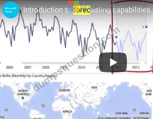
Reference:
https://powerbi.microsoft.com/fr-fr/blog/introducing-new-forecasting-capabilities-in-power-view-for-office-365/
NEW QUESTION 43
You have a prospective customer list that contains 1,500 rows of data. The list contains the following fields:
* First name
* Last name
* Email address
* State/Region
* Phone number
You import the list into Power Query Editor.
You need to ensure that the list contains records for each State/Region to which you want to target a marketing campaign.
Which two actions should you perform? Each correct answer presents part of the solution.
NOTE: Each correct selection is worth one point.
- A. Enable Column profiling based on entire dataset.
- B. Open the Advanced Editor.
- C. Select Column distribution.
- D. Select Column profile.
- E. Select Column quality.
Answer: C,D
Explanation:
Data Profiling, Quality & Distribution in Power BI / Power Query features To enable these features, you need to go to the View tab Data Preview Group Check the following:
* Column quality
* Column profile
* Column distribution
* Column profile
Turn on the Column Profiling feature.

Can use it to visually realize that your query is missing some data because of distinct and uniqueness counts.
Reference:
https://www.poweredsolutions.co/2019/08/13/data-profiling-quality-distribution-in-power-bi-power-query/
https://www.altentertraining.com/microsoft/power-bi/column-profiling-is-good/
NEW QUESTION 44
You are creating a quick measure as shown in the following exhibit.
You need to create a monthly rolling average measure for Sales over time-How should you configure the quick measure calculation? To answer, select the appropriate options in the answer area.
NOTE: Each correct selection is worth one point.
Answer:
Explanation:
Explanation:
Box 1: Total Sales
We select the field Total Sales
Box 2: Date
Select a date field.
Box 3: Month
Monthly periods.
Reference:
https://docs.microsoft.com/en-us/power-bi/transform-model/desktop-quick-measures
NEW QUESTION 45
You have a dashboard that contains tiles pinned from a single report as shown in the Original Dashboard exhibit. (Click the Original Dashboard tab.)
You need to modify the dashboard to appear as shown in the Modified Dashboard exhibit. (Click the Modified Dashboard tab.)
What should you do?
- A. Change the dashboard theme.
- B. Create a custom CSS file.
- C. Edit the details of each tile.
- D. Change the report theme.
Answer: A
Explanation:
Depends on where you apply the theme, if on PBI desktop then the answer is report theme, but when you apply the theme from PBI service the answer is dashboard theme.
https://docs.microsoft.com/en-us/power-bi/create-reports/service-dashboard-themes
NEW QUESTION 46
You have a data model that contains many complex DAX expressions. The expressions contain frequent references to the RELATED and RELATEDTABLE functions.
You need to recommend a solution to minimize the use of the RELATED and RELATEDTABLE functions.
What should you recommend?
- A. Split the model into multiple models.
- B. Transpose.
- C. Merge tables by using Power Query.
- D. Hide unused columns in the model.
Answer: C
Explanation:
Combining data means connecting to two or more data sources, shaping them as needed, then consolidating them into a useful query.
When you have one or more columns that you'd like to add to another query, you merge the queries.
Note: The RELATEDTABLE function is a shortcut for CALCULATETABLE function with no logical expression.
CALCULATETABLE evaluates a table expression in a modified filter context and returns A table of values.
Reference:
https://docs.microsoft.com/en-us/power-bi/connect-data/desktop-shape-and-combine-data
NEW QUESTION 47
Note: This question is part of a series of questions that present the same scenario. Each question in the series contains a unique solution that might meet the stated goals. Some question sets might have more than one correct solution, while others might not have a correct solution.
After you answer a question in this section, you will NOT be able to return to it. As a result, these questions will not appear in the review screen.
You are modeling data by using Microsoft Power Bl. Part of the data model is a large Microsoft SQL Server table named Order that has more than 100 million records.
During the development process, you need to import a sample of the data from the Order table.
Solution: You write a DAX expression that uses the FILTER function.
Does this meet the goal?
- A. No
- B. Yes
Answer: A
Explanation:
Explanation
The filter is applied after the data is imported.
Instead add a WHERE clause to the SQL statement.
Reference:
https://docs.microsoft.com/en-us/power-bi/connect-data/service-gateway-sql-tutorial
NEW QUESTION 48
Case Study 1 - Litware, Inc.
Overview
Litware, Inc. is an online retailer that uses Microsoft Power Bl dashboards and reports. The company plans to leverage data from Microsoft SQL Server databases, Microsoft Excel files, text files, and several other data sources.
Litware uses Azure Active Directory (Azure AD) to authenticate users.
Existing Environment
Sales Data
Litware has online sales data that has the SQL schema shown in the following table.
In the Date table, the dateid column has a format of yyyymmdd and the month column has a format of yyyymm. The week column in the Date table and the weekid column in the Weekly_Returns table have a format of yyyyww. The regionid column can be managed by only one sales manager.
Data Concerns
You are concerned with the quality and completeness of the sales data. You plan to verify the sales data for negative sales amounts.
Reporting Requirements
Litware identifies the following technical requirements:
- Executives require a visual that shows sales by region.
- Regional managers require a visual to analyze weekly sales and
returns.
- Sales managers must be able to see the sales data of their respective region only.
- The sales managers require a visual to analyze sales performance
versus sales targets.
- The sale department requires reports that contain the number of sales transactions.
- Users must be able to see the month in reports as shown in the
following example: Feb 2020.
- The customer service department requires a visual that can be
filtered by both sales month and ship month independently.
You need to create the required relationship for the executive's visual.
What should you do before you can create the relationship?
- A. Change the data type of sales[sales_id] to Text.
- B. Change the data type of sales [region_id] to Decimal Number.
- C. In the Sales table, add a measure for sum(sales_amount).
- D. Change the data type of Sales[region_id] to Whole Number.
Answer: A
NEW QUESTION 49
You create the following step by using Power Query Editor.
= Table.ReplaceValue(SalesLT_Address,"1318","1319",Replacer.ReplaceText,{"AddressLine1"}) A row has a value of 21318 Lasalle Street in the AddressLine1 column. What will the value be when the step is applied?
- A. 0
- B. 21318 Lasalle Street
- C. 21319 Lasalle Street
- D. 1
Answer: C
Explanation:
Explanation
Example:
Replace the text "ur" with the text "or" in the table.
Reference:
https://docs.microsoft.com/en-us/powerquery-m/table-replacevalue
NEW QUESTION 50
You plan to join a fact table named ActivityLog to a Date dimension named ActivityDate. The date value in ActivityLog is a datetime column named ActivityStart. The date value in ActivityDate is a number column named DateID. DateID is in the YYYYMMDD format.
What should you do in the model before you create the relationship?
- A. Change the Data Type of DateID to Date.
- B. Change the Data Type of ActivityStart to Date.
- C. Create a calculated column in ActivityLog that uses the FORMAT DAX function.
- D. Create a measure in ActivityLog that uses the FORMAT DAX function.
Answer: C
NEW QUESTION 51
You are creating a Microsoft Power BI data model that has the tables shown in the following table.
The Products table is related to the ProductCategory table through the ProductCategoryID column.
You need to ensure that you can analyze sales by product category.
How should you configure the relationships from Products to ProductCategory? To answer, select the appropriate options in the answer area.
NOTE: Each correct selection is worth one point.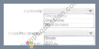
Answer:
Explanation:
Explanation
Box 1: One-to-many
Box 2: Both
For One-to-many relationships, the cross filter direction is always from the "one" side, and optionally from the
"many" side (bi-directional).
Note:
Reference:
https://docs.microsoft.com/en-us/power-bi/transform-model/desktop-relationships-understand
NEW QUESTION 52
You have five sales regions. Each region is assigned a single salesperson.
You have an imported dataset that has a dynamic row-level security (RLS) role named Sales.
The Sales role filters sales transaction data by salesperson.
Salespeople must see only the data from their region.
You publish the dataset to powerbi.com, set RLS role membership, and distribute the dataset and related reports to the salespeople.
A salesperson reports that she believes she should see more data.
You need to verify what data the salesperson currently sees.
What should you do?
- A. Use the Test as role option to view data as the salesperson's user account.
- B. Filter the data in the reports to match the intended logic in the filter on the sales transaction table.
- C. Use the Test as role option to view data as the Sales role.
- D. Instruct the salesperson to open the report in Microsoft Power Bl Desktop.
Answer: C
NEW QUESTION 53
You have a power BI tenant that hosts the datasets shown in the following table.
You have the following requirements:
* The export of reports that contain Personally Identifiable Information (Pll) must be prevented.
* Data used for financial decisions must be reviewed and approved before use.
For each of the following statements, select Yes if the statement is true. Otherwise select No. NOTE: Each correct selection is worth one point
Answer:
Explanation:
NEW QUESTION 54
You have a large dataset that contains more than 1 million rows. The table has a datetime column named Date.
You need to reduce the size of the data model.
What should you do?
- A. Trim the Date column.
- B. Split the Date column into two columns, one that contains only the time and another that contains only the date.
- C. Round the hour of the Date column to startOfHour.
- D. Change the data type of the Date column to Text.
Answer: B
Explanation:
Explanation: We have to separate date & time tables. Also, we don't need to put the time into the date table, because the time is repeated every day.
Split your DateTime column into a separate date & time columns in fact table, so that you can join the date to the date table & the time to the time table. The time need to be converted to the nearest round minute or second so that every time in your data corresponds to a row in your time table.
Reference:
https://intellipaat.com/community/6461/how-to-include-time-in-date-hierarchy-in-power-bi
NEW QUESTION 55
You are preparing a financial report in Power BI.
You connect to the data stored in a Microsoft Excel spreadsheet by using Power Query Editor as shown in the following exhibit.
You need to prepare the data to support the following:
* Visualizations that include all measures in the data over time
* Year-over-year calculations for all the measures
Which four actions should you perform in sequence? To answer, move the appropriate actions from the list of actions to the answer area and arrange them in the correct order.
Answer:
Explanation:
Explanation
Reference:
https://support.microsoft.com/en-us/office/unpivot-columns-power-query-0f7bad4b-9ea1-49c1-9d95-f588221c70
NEW QUESTION 56
You have an API that returns more than 100 columns. The following is a sample of column names.
* client_notified_timestamp
* client_notified_source
* client_notified_sourceid
* client_notified_value
* client_responded_timestamp
* client_responded_source
* client_responded_sourceid
* client_responded_value
You plan to include only a subset of the returned columns.
You need to remove any columns that have a suffix of sourceid.
How should you complete the Power Query M code? To answer, select the appropriate options in the answer area.
NOTE: Each correct selection is worth one point.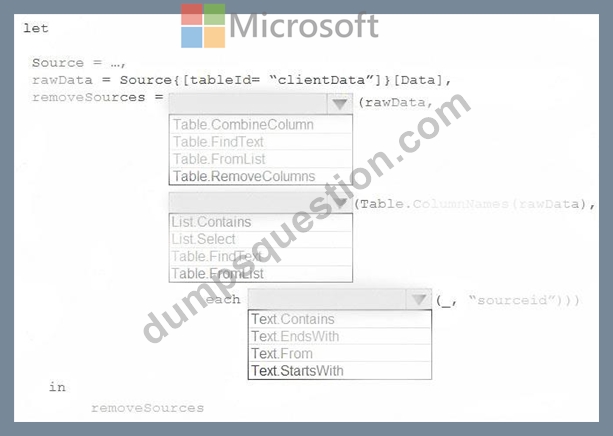
Answer:
Explanation:
Explanation
Box 1: Table.RemoveColumns
When you do "Remove Columns" Power Query uses the Table.RemoveColumns function Box 2: List.Select Get a list of columns.
Box 3: Text.EndsWith
NEW QUESTION 57
......
100% Free DA-100 Daily Practice Exam With 142 Questions: https://www.dumpsquestion.com/DA-100-exam-dumps-collection.html